Updated 06/04/2021 : adding select input and date picker
Handling forms in react native is a crucial task in your journey as a react native developer, you can’t think about developing a new react native app without dealing with forms, at least for login and sign up screen in case your app is retrieving data in the most of the cases. Finding a solution for such a repetitive task will help you save a lot of time for your next sprint 😉.
Through My 2 years experience As a react native developer, I used to use different approaches to handle forms without feeling confident about the best solution that deserves a new article. Today I am confident to share with you the right way to handle forms in your next react native project. I would be more than happy to hear your remarks and thoughts about this solution ( this is why i am sharing this article)
This article is a step-by-step tutorial to create a generic form component that can be used whenever you need to deal with forms.
if you are impatient and want to go straight to the code, you can play around with the solution in this Snack Editor Project. 😀
Approach
The idea is based on empowering react-hook-form with a smart form component that can compose any Input child, collect data and handle errors automatically. Also, we are going to provide an automatic way to autofocus the next input after pressing the next keyboard button and adding a keyboard aware capability for our inputs.
To make it clear we need first to create a custom Input component with error handling. then create a smart Form Component that injects all react-hook-form properties correctly for each component, and finally implement the autofocus and keyboard aware features.
This is the end result of our Work.
You can’t record keyboard for secureTextEntry={true} Input, that’s why you are seeing my password 😀
<video autoplay controls style={{width: ‘100%’, maxWidth: ‘1020px’}} className=“Image__Small”>
Before starting I think you are wondering 👇
Why React-hooks-form
Form React-hook-form official documentation, one of the primary goals of React Hook Form is to reduce the amount of code that you have to write. As you can see from our final result, React hooks form is really easy to use and it takes a small amount of code. More than that if we can compare react-hook-form to the most used solution to handle forms in React such as Formik and redux-form, it seems clear that react-hook-form will be the winner regarding bundle size and performance.
React-hook-form home page contains a complete section illustrating why you should use it over other libraries.
Let’s get started
Create a Custom Input
In the first step, we are going to create a custom text input component with error handling, As you see we try to make the component as simple as possible but you could style your component as you want or even use a TextInput from built-in UI library such us react-paper or native-base, the solution will work as expected regardless of your Input implementation as long as the custom input implements the React forward API and has a required name property.
import * as React from 'react'import {  View,  TextInput,  Text,  StyleSheet,  ViewStyle,  TextStyle,  TextInputProps,} from 'react-native'import { FieldError } from 'react-hook-form'interface Props extends TextInputProps {  name: string  label?: string  labelStyle?: TextStyle  error?: FieldError | undefined}
export default React.forwardRef<any, Props>(  (props, ref): React.ReactElement => {    const { label, labelStyle, error, ...inputProps } = props
    return (      <View style={styles.container}>        {label && <Text style={[styles.label, labelStyle]}>{label}</Text>}        <TextInput          autoCapitalize="none"          ref={ref}          style={[            styles.inputContainer,            { borderColor: error ? '#fc6d47' : '#c0cbd3' },          ]}          {...inputProps}        />        <Text style={styles.textError}>{error && error.message}</Text>      </View>    )  })
You can use The InputProps type from our component to implement your custom one and to make sure your component is ready for the next step.
Create Form Component
The idea behind the form component is to iterate component children and register all input by adding the correct properties.
The form component will receive its prop from the useForm hook and these are properties that we need to be passed to Make sure our Form Component works correctly.
- register: This method allows us to register the input Ref with a unique name and validation rules into React Hook Form.
register: ({name}: {name: string}, validation: ValidationOptions) => void;- setValue: This function will help us to dynamically set input value to the correct ref using
nameproperty. We need to use setValue because we are going to use a custom register call.
setValue: (name: string, value: string, shouldValidate?: boolean) => void;- Errors: Object containing form errors and error messages corresponding to each input.
- Validation: Object containing form validation rules for each input.
If you are not familiar with react-hook-form, check the docs here
In order to inject Props to Input children, we are going to use React.createElement API to create new Element for every child with a name property.
By using the name property We can filter all Input that needs to be part of our form data or return the child without creating a new one if it’s not the case.
For each Input child, we use the register function to register inputs manually inside useEffect and inject validation rules.
By using the custom register call, we will need to update the input value manually with setValue using the onChangeText Input property.
Finally, we’ll add the error and error message corresponding to each input.
export default ({ register, errors, setValue, validation, children,}: Props) => { React.useEffect(() => { (Array.isArray(children) ? [...children] : [children]).forEach(child => { if (child.props.name) register({ name: child.props.name }, validation[child.props.name]); }); }, [register]); return ( <> {(Array.isArray(children) ? [...children] : [children]).map(child => { return child.props.name ? React.createElement(child.type, { ...{ ...child.props, onChangeText: (v: string) => setValue(child.props.name, v, true), key: child.props.name, error: errors[child.props.name], }, }) : child; })} </> );};Now, Our Form Component is Ready, but before closing the article I want to improve The form component by providing a way to autofocus the next input automatically after pressing next keyboard button, which I think is an important feature to ensure good user experience.
The only way to focus input in react-native is to have a ref for your input instance and call the focus method whenever you want the input to be focused.
To make this work we need to have access to all Inputs refs, detect the next input and call the focus method.
We can make this possible by using an Inputs React Ref in our Form component, then we push children Input Refs one by one.
To focus the next Input, we need to implement the onSubmitEditing property which will be called after pressing the next keyboard button. we need to focus the next input by invoking focus method for the next input Ref or call blur if the next input Ref doesn’t exist.
Worth mentioning, that onSubmitEditing callback is called after blur event. So the keyboard may go crazy if it focuses on the next element immediately. It might be helpful to set blurOnSubmit={false} to all elements in the form.
import * as React from 'react';import {TextInput} from 'react-native';import {ValidationOptions, FieldError} from 'react-hook-form';
interface ValidationMap {  [key: string]: ValidationOptions;}
interface ErrorMap {  [key: string]: FieldError | undefined;}
interface Props {  children: JSX.Element | JSX.Element[];  register: ({name}: {name: string}, validation: ValidationOptions) => void;  errors: ErrorMap;  validation: ValidationMap;  setValue: (name: string, value: string, validate?: boolean) => void;}
export default ({  register,  errors,  setValue,  validation,  children,}: Props) => {  const Inputs = React.useRef < Array < TextInput >> []
  React.useEffect(() => {    (Array.isArray(children) ? [...children] : [children]).forEach((child) => {      if (child.props.name)        register({ name: child.props.name }, validation[child.props.name]);    });  }, [register]);
  return (    <>      {(Array.isArray(children) ? [...children] : [children]).map(        (child, i) => {          return child.props.name            ? React.createElement(child.type, {                ...{                  ...child.props,                  ref: (e: TextInput) => {                    Inputs.current[i] = e                  },                  onChangeText: (v: string) =>                    setValue(child.props.name, v, true),                  onSubmitEditing: () => {                    Inputs.current[i + 1]                      ? Inputs.current[i + 1].focus()                      : Inputs.current[i].blur()                  },                  blurOnSubmit: false,                  key: child.props.name,                  error: errors[child.props.name],                },              })            : child        }      )}    </>  )}
Our Last step is To Use react-native-keyboard-aware-scroll-view component that handles keyboard appearance and automatically scrolls to focused TextInput.
Yep! Our Form Component is Ready for Production 😎And you can play around with it in thisSnack Editor Project.
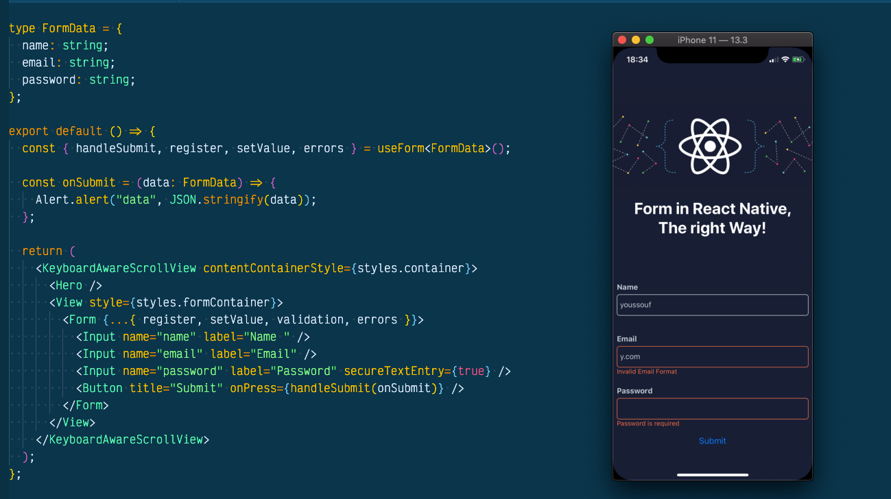
type FormData = {  name: string;  email: string;  password: string;};
export default () => {  const { handleSubmit, register, setValue, errors } = useForm<FormData>();
  const onSubmit = (data: FormData) => {    Alert.alert("data", JSON.stringify(data));  };
  return (    <KeyboardAwareScrollView contentContainerStyle={styles.container}>      <Hero />      <View style={styles.formContainer}>        <Form {...{ register, setValue, validation, errors }}>          <Input name="name" label="Name " />          <Input name="email" label="Email" />          <Input name="password" label="Password" secureTextEntry={true} />          <Button title="Submit" onPress={handleSubmit(onSubmit)} />        </Form>      </View>    </KeyboardAwareScrollView>  );};
Bonus 💎
I received multiple requests on how we can handle custom form input such us select input or even a Birth Date input, Here is How 😉👇👇
import React, { useState } from "react";import { Pressable } from "react-native";import DateTimePickerModal from "react-native-modal-datetime-picker";import { FieldError } from "react-hook-form";import { View, Text, StyleSheet, TextInputProps } from "react-native";
type ValueOptions = {  shouldValidate?: boolean,};
interface Props {  name: string;  label: string;  setValue: (name: string, value: string, options?: ValueOptions) => void;  watch: any;  error?: FieldError | undefined;}
export const DatePickerInput = ({  name,  label,  setValue,  watch,  error,}: Props) => {  const [isOpen, setIsOpen] = useState(false);  const value = watch(name);
  const hideDatePicker = () => {    setIsOpen(false);  };
  const handleConfirm = (pubDatetime: any) => {    const d = formatDate(date);    setValue(name, d, { shouldValipubDatetime: true });    hideDatePicker();  };
  return (    <Pressable onPress={() => setIsOpen(true)}>      <View style={styles.container}>        {label && <Text style={[styles.label]}>{label}</Text>}        <View          style={[styles.input, { borderColor: error ? "#fc6d47" : "#c0cbd3" }]}        >          <Text style={styles.text}>{value ? value : "YYYY-MM-DD"} </Text>          <DateTimePickerModal            isVisible={isOpen}            mode="date"            onConfirm={handleConfirm}            onCancel={hideDatePicker}          />        </View>        <Text style={styles.textError}>{error && error.message}</Text>      </View>    </Pressable>  );};
function formatDate(pubDatetime: string) {  let d = new Date(date),    month = "" + (d.getMonth() + 1),    day = "" + d.getDate(),    year = d.getFullYear();
  if (month.length < 2) month = "0" + month;  if (day.length < 2) day = "0" + day;
return [year, month, day].join("-");}import React from "react";import RNPickerSelect from "react-native-picker-select";import { FieldError } from "react-hook-form";import { View, Text, StyleSheet, TextInputProps } from "react-native";
type ValueOptions = { shouldValidate?: boolean,};
interface Props extends TextInputProps { name: string; label: string; setValue: (name: string, value: string, options?: ValueOptions) => void; watch: any; error?: FieldError | undefined;}
export const SelectInput = ({ name, label, setValue, watch, error }: Props) => { const value = watch(name); return ( <View style={styles.container}> {label && <Text style={[styles.label]}>{label}</Text>} <View style={[styles.input, { borderColor: error ? "#fc6d47" : "#c0cbd3" }]} > <RNPickerSelect style={pickerSelectStyles} onValueChange={v => setValue(name, v, { shouldValipubDatetime: true }) } items={[ { label: "Female", value: "female" }, { label: "Male", value: "male" }, { label: "Other", value: "other" }, ]} /> </View> <Text style={styles.textError}>{error && error.message}</Text> </View> );};
const pickerSelectStyles = StyleSheet.create({ inputIOS: { borderStyle: "solid", borderRadius: 5, // paddingVertical: 5, paddingLeft: 5, fontSize: 16, height: 40, color: "#c0cbd3", borderColor: "#c0cbd3", justifyContent: "center", }, inputAndroid: { borderStyle: "solid", borderRadius: 5, paddingVertical: 5, paddingLeft: 5, fontSize: 16, height: 40, color: "#c0cbd3", borderColor: "#c0cbd3", justifyContent: "center", },});And this is how you can use them:
type FormData = {  gender: string;  pubDatetime: string;};
export default () => {  const { handleSubmit, register, setValue, errors } = useForm<FormData>();
  const onSubmit = (data: FormData) => {    Alert.alert("data", JSON.stringify(data));  };
  React.useEffect(() => {    register("gender", validation.gender);    register("date", validation.date);  }, [register]);
  return (    <KeyboardAwareScrollView contentContainerStyle={styles.container}>      <Hero />      <View style={styles.formContainer}>        <SelectInput          name="gender"          label="Gender"          setValue={setValue}          watch={watch}          error={errors?.gender}        />        <DatePickerInput          name="date"          label="Date"          setValue={setValue}          watch={watch}          error={errors?.date}        />        <Button title="Submit" onPress={handleSubmit(onSubmit)} />      </View>    </KeyboardAwareScrollView>  );};
I hope you found that interesting, informative, and entertaining. I would be more than happy to hear your remarks and thoughts about this solution in The comments.
If you think other people should read this post. Tweet, share and Follow me on twitter for the next articles.
Originally published on https://obytes.com/