This article is a step by step tutorial to create a simple burger menu for your website by using reactjs-popup

Reactjs-popup is a new and simple react popup component built using react fragments which is one of the new features that comes with react 16. And it can handle multiple use cases.By using this tiny react popup component you can create a Tooltips, Modals and Menus.
By the end of this article you will be able to create your custom burger menu with reactjs-popup.
Ready!! Let’s get started.
Step 1: Create the burger Icon component.
We will start by building a burger icon component,
import React from "react";
export default ({ open, ...props }) => (  <div className={open ? "burger-menu open" : "burger-menu"} {...props}>    <div className="bar1" key="b1" />    <div className="bar2" key="b2" />    <div className="bar3" key="b3" />  </div>);
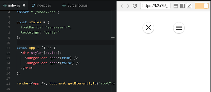
As you see we pass the ‘open’ prop to the component so we can permute the icon class name as the preview example explains
.burger-menu,.burger-menu.open {  display: inline-block;  cursor: pointer;  position: fixed;  right: 20px;  bottom: 40px;  z-index: 9999;  background: #fff;  padding: 10px;  border-radius: 25px;  box-shadow: 0 1px 4px rgba(0, 0, 0, 0.3);}
.burger-menu .bar1,.bar2,.bar3 {  width: 25px;  height: 3px;  background-color: #333;  margin: 4px 0;  transition: 0.4s;}
.burger-menu.open .bar1 {  -webkit-transform: rotate(-45deg) translate(-4px, 4px);  transform: rotate(-45deg) translate(-4px, 4px);}
.burger-menu.open .bar2 {  opacity: 0;}
.burger-menu.open .bar3 {  -webkit-transform: rotate(45deg) translate(-6px, -6px);  transform: rotate(45deg) translate(-6px, -6px);}
burger Icon state
You can find some good examples for burger icon with animation here
Step 2: Customize CSS Menu
Our menu will be a simple list, so let’s take the reactjs-popup home page menu and use it as an example.
import React from "react";
export default ({ close }) => (  <div className="menu">    <ul>      <li onClick={close}>Home</li>      <li onClick={close}>Getting Started</li>      <li onClick={close}>Component API</li>      <li onClick={close}>Use Case - Tooltip</li>      <li onClick={close}>Use Case - Modal</li>      <li onClick={close}>Use Case - Menu</li>      <li onClick={close}>Contributing</li>    </ul>  </div>);
As you see this menu is a simple ul element, nothing special.
Step 3:integrate all stuff with reactjs-popup
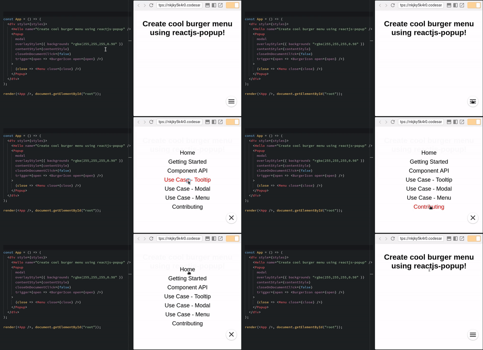
All we need to do in this part is to import the reactjs-popup component and set the burger menu as a trigger prop for the popup component and the menu as the popup children. simple, is it ? magic !!
Thanks to the ‘function as a children pattern’ the trigger can access to the popup state easily. we need also to pass props to the burger component like the following.
Adding some custom css and this is the final result.

If you read this article from your smartphone , you can see the burger button to launch the menu in reactjs-popup home page.
Demo Code source
yjose/reactjs-popup-burger-menu _reactjs-popup-burger-menu - reactjs-popup burger menu example_github.com
Thanks for reading! If you think other people should read this post and use this component,tweet and share the post.
Remember to follow me on Medium so you can get notified about my future posts.
If you liked this story, feel free to 👏👏👏 a few times (Up to 50 times. Seriously).