I recently worked through a short tutorial about creating simple tooltips using pure CSS (and no additional HTML element or JavaScript). I later used this technique in my own project, and figured out some tricks to improve upon it.
This article is a step-by-step tutorial that will help you understand these CSS tricks so you can make pure-CSS tooltips, too.
By the end of this post, you’ll know how to add a tooltip to any element by adding a simple attribute.
The problem
I needed to create a custom tooltip for my project.
I started off by Googling “CSS Tooltip Generator. I found quite a few generators. Their approach was to add a span with an absolute position inside the element you want a tooltip for.
But I already had an otherwise-complete project. I didn’t want to go back through and add all these span elements throughout my project. This would take time and will complicate my HTML. There had to be a better way.
At last, I found an amazing tutorial on YouTube about tooltips. The smart trick it used was to create a tooltip using the :: before and :: after CSS selectors. You can watch the video here.
This trick is was smart and clean, but it wasn’t generic enough.
Improving upon the solution
In this part, I’ll make this trick more generic and we’ll discover more about some CSS properties. Here’s what we ultimately want to be able to do:
<button tooltip="tooltip content here">click here !!</button>Not only that, but we want to be able to specify the tooltip position easily:
<button tooltip="tooltip content here" tooltip-position="left"> click here !!</button>First — as mentioned in the video — we’ll add a before and an after pseudo element to the button.
::after and ::before are pseudo-elements, which allow you to insert content onto a page from CSS before or after the content of the element. They work like this:
div::after { content: "after";}div::before { content: "before";}The result looks something like this:
<div> before <!-- div content here --> after</div>Let’s walk through this step-by-step
Step 1: we’ll add a tooltip attribute like this:
<button tooltip="simple tooltip here">click Me !!</button>We need ::after and ::before pseudo-elements. These will be a simple rectangle with the content of the tooltip. We create a simple rectangle with CSS by adding a border around an empty element that we create with the content property.
The ::before pseudo-element is used to show the tooltip content. We add it with the property content and extract the tooltip attribute value. The value for content can be a string, an attribute value from the element like our example, or even an image with url(path/image.png).
To make this work, the button element’s position must be relative. In other words, the position of all elements inside the button is relative to the position of the button element itself.
We add also some position tricks to make the tooltip in the center with the transform property and this the result.
Here’s our CSS:
button { margin: auto; background: #3498db; font-family: Arial; color: #ffffff; font-size: 14px;}[tooltip] { margin: 20px; position: relative;}[tooltip]::before { content: ""; position: absolute; top: -6px; left: 50%; transform: translateX(-50%); border-width: 4px 6px 0 6px; border-style: solid; border-color: rgba(0, 0, 0, 0.7) transparent transparent transparent; z-index: 100;}[tooltip]::after { content: attr(tooltip); position: absolute; left: 50%; top: -6px; transform: translateX(-50%) translateY(-100%); background: rgba(0, 0, 0, 0.7); text-align: center; color: #fff; padding: 4px 2px; font-size: 12px; min-width: 80px; border-radius: 5px; pointer-events: none;}Step 2: we just play with the ::before and ::after pseudo-elements to create a tooltip position. Our button HTML will look like this:
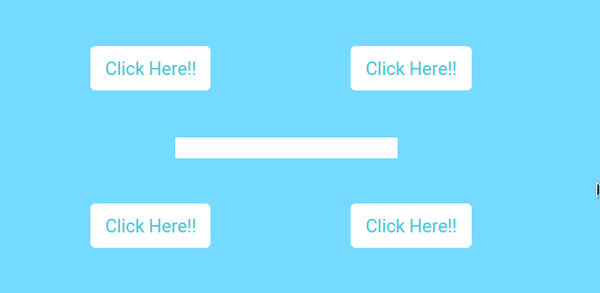
<button tooltip="tooltip here" tooltip-position="left">click here !!</button>The tooltip-position can be: right, left, top, or bottom.
[tooltip-position="left"]::before { left: 0%; top: 50%; margin-left: -12px; transform: translatey(-50%) rotate(-90deg);}[tooltip-position="top"]::before { left: 50%;}[tooltip-position="bottom"]::before { top: 100%; margin-top: 8px; transform: translateX(-50%) translatey(-100%) rotate(-180deg);}[tooltip-position="right"]::before { left: 100%; top: 50%; margin-left: 1px; transform: translatey(-50%) rotate(90deg);}[tooltip-position="left"]::after { left: 0%; top: 50%; margin-left: -8px; transform: translateX(-100%) translateY(-50%);}[tooltip-position="top"]::after { left: 50%;}[tooltip-position="bottom"]::after { top: 100%; margin-top: 8px; transform: translateX(-50%) translateY(0%);}[tooltip-position="right"]::after { left: 100%; top: 50%; margin-left: 8px; transform: translateX(0%) translateY(-50%);}step 3: in this final step, we will add a simple hover animation to the tooltip.
[tooltip]:hover::after,[tooltip]:hover::before { opacity: 1;}This CodePen shows the end result (and you can click through to see the final code):
https://codepen.io/yjose/pen/KWEqMg
I hope you found that interesting, informative, and entertaining. I would be more than happy to hear your remarks and thoughts.
If you think other people should read this post. Tweet, share and Follow me on twitter for the next articles.
Reac More 👉 GraphQL: Front-End Superpower